Effective mobile app design covers many areas: aesthetically it should be consistent with your brand; structurally it should follow best design practices depending on the platform and devices being designed for; and from a UX standpoint, it needs to provide your users with a seamless, intuitive experience.
At Clearbridge, the end user is the focus of design decisions. Our design process is integrated with our product definition and discovery, which allows us to gather important information about the users, their journey, the pain points the application is addressing, and how to approach UI/UX in a way that is driven by all of these considerations. This allows us to consider not only utility of the app but also usability – before development even begins.
Starting With The User
One of the biggest challenges companies face when launching an app is user abandonment. It happens for a myriad of reasons, but poor user experience is often the culprit. This is commonly a result of not putting the user at the center of design decisions.
In user-centered design, you need to focus on creating a product that will address the needs and pain points of users; this means knowing who they are, and what steps need to happen for them to achieve certain goals or solve their pains.
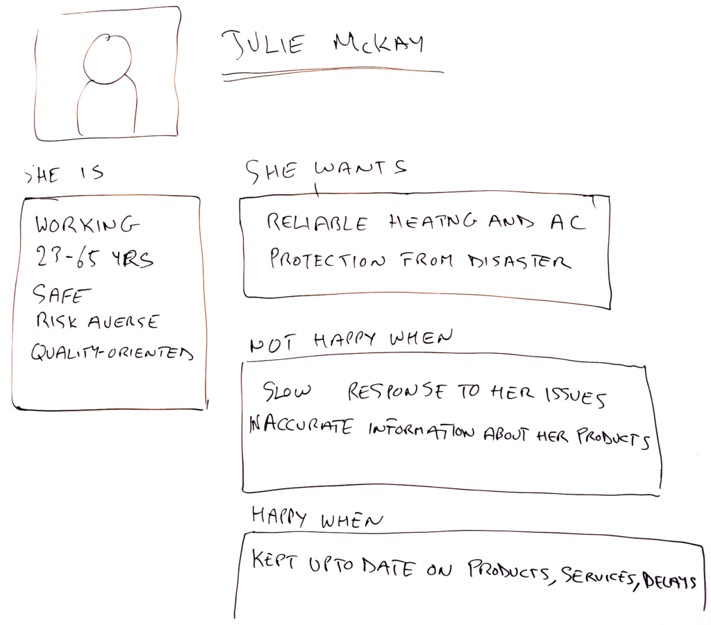
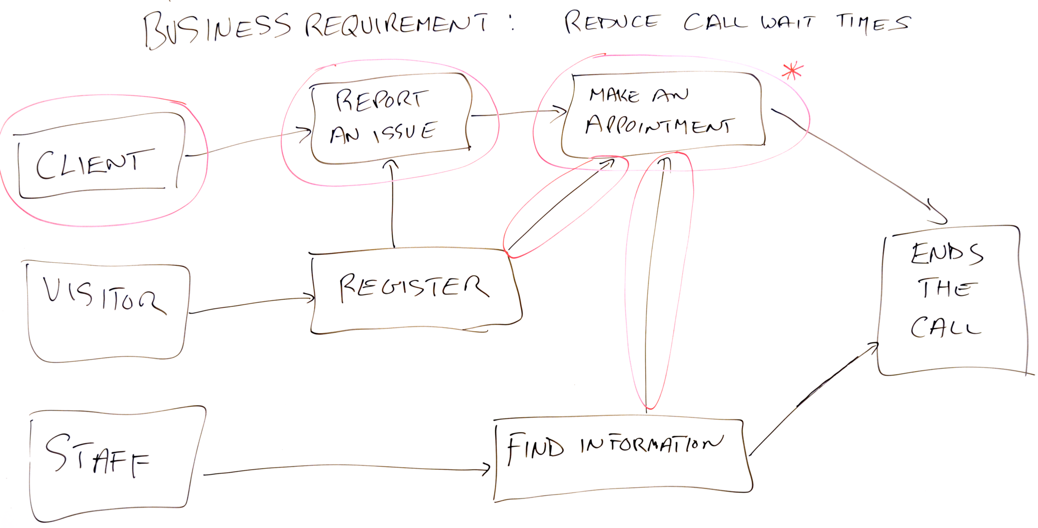
We address these during product discovery through the creation of user personas and user journey maps, which is why designers are deeply involved in this process.
Creating User Personas
User personas answer fundamental questions about the user: who, what, where, and when.
- Who is/are the user/users?
- What are the user’s goals for using the product?
- Where does the user use the product?
- When does the user use the product?
User personas help you understand the demographics of the end user and gather important behavioral information and insight that will guide product decisions, including any UI/UX decisions. Our designers conduct additional research after the creation of user personas to gather more details pertinent to design considerations, which we’ll talk about more below.
Customer Journey Mapping
User journey mapping builds on user personas. For each user persona, we map the story ending (the end goal of that user, for example, create a profile), and all of the actions that are needed in order for the user to get to that point.
From a design perspective, user journey mapping provides the foundation of the UX in terms of structure and user flow. By understanding the actions necessary to get the user from point A to point B, we can begin to think about how to optimize this journey.
Brand Research & Additional User Research
Building on the product discovery session, user personas, and journey mapping, our designers conduct additional user research and brand research. We look at existing brand properties to gain an understanding of the right personality, tone, look, and feel for the application. We also take a deeper dive into the end users to gain more information about them and make sensible design decisions. This sets the tone and allows us to understand which elements to prioritize with the design. For example, if we find that the majority of the user demographic is 50 years of age or older, we will avoid certain design elements like smaller text, thin lines, etc.
Prototyping & Conceptualization
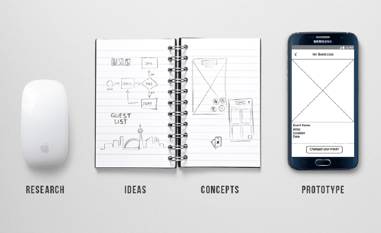
We then begin the prototyping and conceptualization, which focuses on the UX (structure) of the app. It determines how the design will flow from one screen to another, how users will navigate forward and back, etc. Often, the series of actions users need to take is complex, particularly in large apps with many features. The purpose is to simplify and streamline the user journey from point A to point B so that the user can get exactly where they want with the least amount of effort.
Research & UI (User Interface)
The UI focuses on the style, polish, and refinement of the app: things like color palettes, fonts, the spacing of elements, icons, shades, whether to use a flat design or skeuomorphism and so on. During this stage, we again do brand research to determine what is most fitting for the brand personality and tone.
Continuous Testing & Refinement
This isn’t a step within the process per se, as we continually test, iterate, and refine throughout. During design, we test on different devices and different platforms and have a variety of people conduct user testing. This lets us discover whether our assumptions about elements and design decisions need to be re-examined.
Designers work with developers to “break up” the UI into pieces that can then be developed. Again, iteration and refinement is a large part of this process so we can create the best user experience and most technically sound product possible. The purpose of our integrated process is to allow us to maintain this flexibility and be adaptable to changes without affecting velocity.
Taking an integrated, user-centric design approach helps ensure that a) the product is being built for your users, specifically and b) we remain adaptable to changes in objectives or project goals. Ultimately, this approach promotes the development of usable, useful products that add value for users and make their lives a lot easier.


