Every member of the team serves the content king during some point in the development process. Large scale projects can involve writers from different teams – from marketing to legal – and multiple incoming data channels that require technical strategies to manage.
Part of a user experience designer’s job is to understand the incoming content, and to facilitate where, when, how and how much content is displayed to the user.
When Content Needs a Makeover
More often than not, the existing or incoming content that development teams are given to work with is problematic. Data can be unreliable or formatted incorrectly. Character and line lengths can get out of hand quickly if they aren’t strictly managed. Copy is almost always longer than desirable and is a struggle to cut to down with multiple stakeholders involved. Designing for mobile introduces a unique set of pain points due to the small screen sizes. Here are some common scenarios where your content will most likely need some help.
Moving from Web to Mobile
Even seemingly short pieces of text on the web can be exhausting on a mobile screen. Sometimes clients try to hold on to their lengthy SEO copy, but less is more on mobile. Responsive websites need to use creative solutions so users aren’t faced with endless scrolling through blocks of copy.

User Created Content
A scenario that you have little control over. You can hope for the best but expect the worst any time a user can input content that will be displayed in your product. Users will take advantage of any freedom you give them and can push the product to unexpected lows.
Extracting Data from Outdated Systems
If your customer database is stored in an outdated system or full of ugly data, utilizing it for a sleek new digital platform can be challenging. There are often technical solutions to smooth out the kinks but sometimes the data system requires more of an overhaul than expected.
Effective Content Management
-
Know the Content
Content can often be forgotten at the start of a project but it should be an important piece of the discovery phase. Getting to know the client’s existing content and data can inform design decisions and get the ball rolling for content management discussions. Starting your designs with realistic dummy data, rather than lorem ipsum, can open the conversation to potential oversights earlier rather than later.
-
Develop a Content Strategy
The development team should work with the client to develop a content strategy that considers the target audience, the hierarchy of content pieces and calls to action. At this stage, the team can discuss possible technical solutions to handle difficult data. Error handling and messaging is important to establish early on as well.
-
Define Limits
Don’t be afraid to be strict. While the content is being discovered and/or created, it is important to define limitations for copy and input fields. It is important to give writers a guide for minimum and maximum character lengths. For user-created content, set as many rules as necessary and give suggestions when possible to guide the user to input good data.
-
Create Content Models
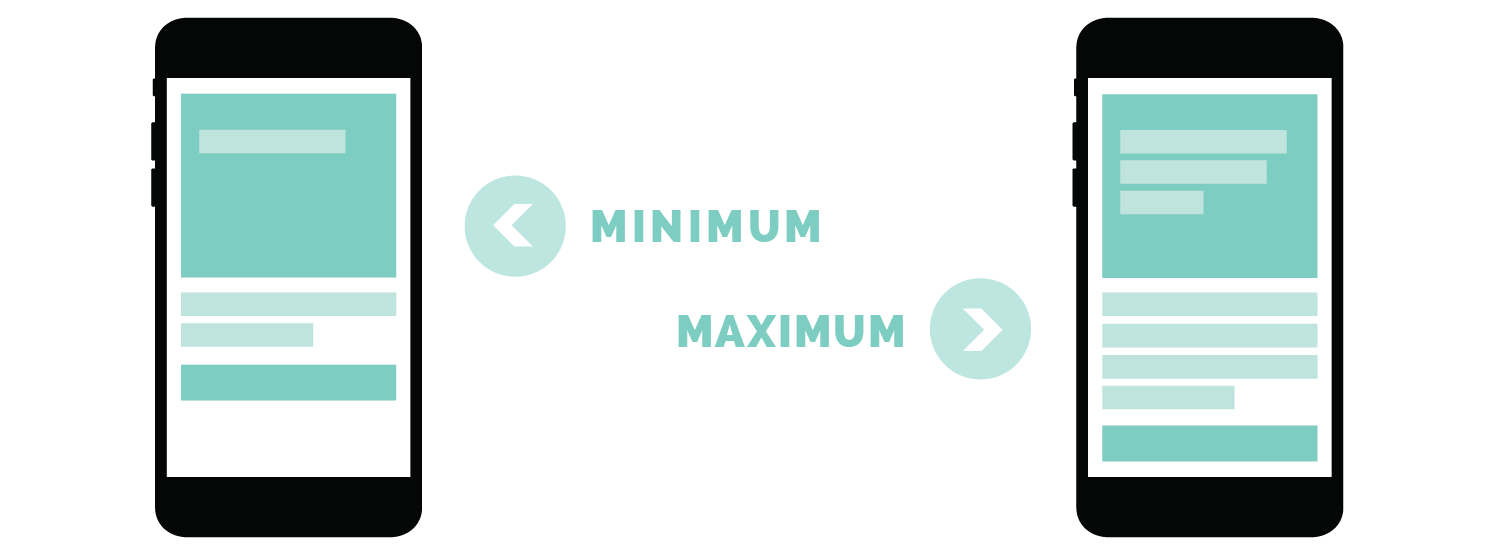
It is important to test copy lengths in your designs, especially for screens where copy is expected to fluctuate. You can’t design one screen for the ideal length of content. Screens should not look empty with the minimum copy or overflow with the maximum. At times, alternative design solutions will need to be programmatically enforced to handle longer or shorter copy than desirable. Keep your designs flexible, plan for iteration, and focus on the important content.

-
Implement & Test
Content guides can communicate the decided upon limitations so they can be implemented in the CMS and the app. Test your content in the app thoroughly on multiple devices, screen sizes, and rotations to ensure it is displaying as desired. Make sure any default, offline or empty-state copy is relevant. Seek out edge cases of oddly formatted content, especially where users are inputting data.
Good content is crucial to a good user experience, so it’s important to keep it a priority throughout the project, not just at the point of populating it into the app. Allow the content to inform and inspire your designs, but don’t settle for bad content. Copy can be improved, and ugly data should not limit the potential of a product. Work together with your team to optimize your app’s content, even if it requires a creating a roadmap and stages of improvements.


