The lack of direct competition for any program is a shortcut to market penetration. To have this advantage for more than seven years, that’s the real deal; it’s called branding. That was the case with Adobe Photoshop many years ago and it is now for Sketch app.
Website and mobile app designers – and I am no exception – used to prototype on Illustrator, InDesign and Photoshop, as they were the only tools available for the longest time. But these Adobe programs, being created mainly for print jobs, couldn’t cope with the fast-paced online design demand.
Then Sketch app was launched in 2009. It removed all unneeded tools and options, and focused solely on online design. It’s a lot simpler and easier to use. The interface, the design logic, and the exporting mechanism are all optimized to make a designer’s life easier. So, over the years, Sketch totally succeeded in owning and branding this design territory.
After seven years, it seems like Adobe finally admitted the need for such a tool, and worked on Project Comet, launched in March 2016 by the name of Adobe Experience Design, aka, Adobe XD.
Like thousands of designers, I’ve been waiting for it, installed it on the same day it launched, and tried it right away. Here is my first impression about Adobe XD after almost a month of using it.
Sketch vs. Adobe XD Similarities
It’s amazing how Adobe followed Sketch’s lead in many aspects, which means it’s not totally “built from scratch.” Users will easily notice similarities from the second they launch XD. Here are a few things (from a long list) that you should expect to find similar in both platforms:
- Both tools are built only for Mac, at least for now.
- Both have a simple and clean interface with few toolboxes and panels.
- The design inspector; with virtually all its components is following the Sketch version.
- Zoom in and out keyboard shortcut is more like Sketch than other Adobe software; Option + mouse scroll for XD, and command + mouse scroll for Sketch.
- The amazing color picker magnifier that gets the color of any pixel from anywhere on your screen.
- Dynamic Boolean operations for shapes that preserve the original shapes even after adding them together or subtracting them, etc.
Why Choose Sketch Over Adobe XD?
Through its last few updates, Sketch has fixed and optimized many aspects of its own user experience. Here are things that XD might need to catch up on:
Layers. I must start with Layers. For some odd reason, Adobe decided to opt out layers panel on the launch of XD. It’s by far the most wanted feature that users requested from the XD team. Sketch layers are clever, and make it easier to export and handle your design elements.
Plugins. One of the most powerful features in Sketch is the plugins, which is complemented by Sketch Toolbox. It dramatically expands the capabilities of the program itself and links it to almost every other software/platform. Zeplin.io can be used to automate style guides and export assets from Sketch files, for example.
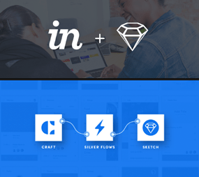
Invision Craft. This is a full set of tools carefully crafted by Invision for Sketch users. From duplicating content to creating styles, these tools take Sketch to the next level, especially for prototyping and managing changes.

Invision Sync. Simply export your sketch artboards directly to Invision Sync. It will seamlessly echo any changes done on Sketch to your live prototype. Can’t be more convenient.
Symbols. Moving to design workflow, Sketch’s Symbol option saves a lot of time and effort; especially if you’ve used it for some time now and start to have a library of your own.
Toolbar. Customizing option for the top banner toolbar is very handy. I wonder why XD doesn’t have something similar. It’s just intuitive.
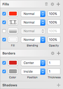
Fill options. Another small but well-thought-out detail in Sketch is the multiple fill/border/shadow effect. It comes in handy when you have a down state for an asset, or simply in early stages when you are still experimenting with colors and effects.

Mirroring. Sketch has a one-click mirroring solution to test your design on your Apple device. Compared to XD share-with-the-team-on-the-Cloud solution, I think it’s more efficient.
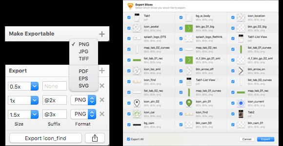
Make exportable. You can make any element in your design exportable and export it with all exporting options in Sketch: different sizes, suffix, formats (vector and raster). On XD, you only can control the assets when you export artboards, which means you need to have each element on a separate artboard before exporting.

Why Choose Adobe XD Over Sketch?
It’s always the case that the second-to-market product is better in some respects. It has the great advantage of avoiding some of the flaws with the first runner, and can challenge, innovate and develop on what users are already satisfied with:
Design and Prototype. XD cleverly gathered both tools in one place. It’s fairly early now to judge the prototype tool or even compare it to others in the market. But, despite it not being “built from scratch”, it’s just handy and convenient to attach it to the Design tool.
Recording. On Prototype tool, the ability of recording and exporting makes preparing presentations easier and more fun.
Content. Repeat Grid option, although it’s not yet fully robust, is still functional. It’s the right tool in the right place and one that can easily get better.
Recommended Reading: 10 Tips for an Effective Content Strategy
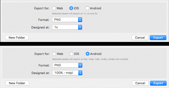
Exporting. Exporting artboards on XD is very smart. It can export directly @1x, 2x, 3x for iOS, all drawables for Android, and PNGs/SVGs for websites. Additionally, you can select the scale you initially designed your files on and it does the math. The best course of action here will be to have each asset on a separately named artboard, click Export, and watch it work its magic.

Feature requests. The fact that they built XD to be reviewed and users can submit feature requests is insightful and useful. They are building connections with end-users of the product and hearing their voice in real time. This will continue to be a great advantage if they can deliver on those requests quickly.
Adobe XD vs. Sketch: Which Will Result in the Best UX?
Despite the fact that XD is coming from a big company like Adobe, Sketch is by far still ahead in the competition, especially with its unmatched collaboration with Invision tools. On the other hand, XD is promising. It has the hard stuff sorted out already, so working quickly to address its shortcomings and add new features could level the playing field.
Recommended Reading: 9 Common UX Mistakes to Avoid
Finally, it’s the kind of situation where whoever wins, we win.


