A user-centric interface should make the user feel as if you’ve read their mind. A smart and delightful interactive experience is as close to magic as technologically possible. This is accomplished by designing an experience that meets a user’s needs with little input required.
An effective strategy to create such an experience is contextual design. A context-aware user interface continually adapts to the ideal form by leveraging available data and anticipating user needs.
What Is Contextual Design?
Contextual design presents the most relevant content and/or functions up front at all times. In doing so, the flow is controlled, taps/clicks are reduced, and both clutter and stagnant empty states are avoided. As soon as an app is opened, its purpose should be clear and the next step should always be obvious. Context-aware apps don’t sit and wait for user input before they come to life; they evolve with the user.
“Context-aware apps don’t sit and wait for user input before they come to life; they evolve with the user”
Contextual Design is Data Driven
Contextual design can take many considerations into account, including but not limited to: the user and their role, the task at hand or the step in a process, the user’s location, the time and date, or the device being used (as identified by Kaltz et al.).
-
- User/Role – Airbnb has two sides to their app based on the user’s role: traveling or hosting. The UI is unique to each role because the functions and priorities differ depending on the type of user.
-
- Task/Process – The VIA Rail home screen presents a large call to action to book a ticket because this is the main function of the app until the user has an active ticket. When a user has an upcoming trip, the home page adapts to show these details and provides quick access to the ticket so you’re prepared to travel the moment you open the app.
-
- Location – Mapping, transit, travel, weather, news, sports, events, retail, restaurants, and a seemingly endless number of other apps rely on location data to be instantly relevant to each user. At a deeper level, apps that know whether you’re home, at work, or out of town can mold to suit those situations.
-
- Time/Date – Morning news, midday meditation, end of the day reflections. If you’re anything like me, you have a constant stream of reminders or prompts via push notifications during the day. The time of the year can be relevant as well. You can predict whether a user needs a maintenance appointment for their furnace or for their air conditioner.
-
- Device – Responsive web designers are familiar with adapting interfaces based on screen size, but device awareness can be useful at a more granular level in order to understand limitations and identify potential pitfalls. For example, you wouldn’t want to prompt an iPhone 5 user to use a 3D Touch gesture.
The relevant data and its ideal applications depend on the core objectives of your app. When designing a solution ask yourself the following exploration questions to determine what information may aid the experience:
- Who are your users and how do they differ from each other?
- Why is the user opening your app? What are they expecting to do? What are you offering them?
- Does the user’s input affect the app? How can the app reflect or adapt to the user’s input?
- Is your app’s content relevant to time or location?
- Does your app have more or different value at a certain time or location? How will the user’s experience change based on these factors? Will the user be looking for different content or features depending on their location or the time?
- Is your app’s functionality tied to or affected by the device in use? How can your app provide an ideal solution for all users regardless of device or other limitations?
Contextual Design is Effortless – For The User
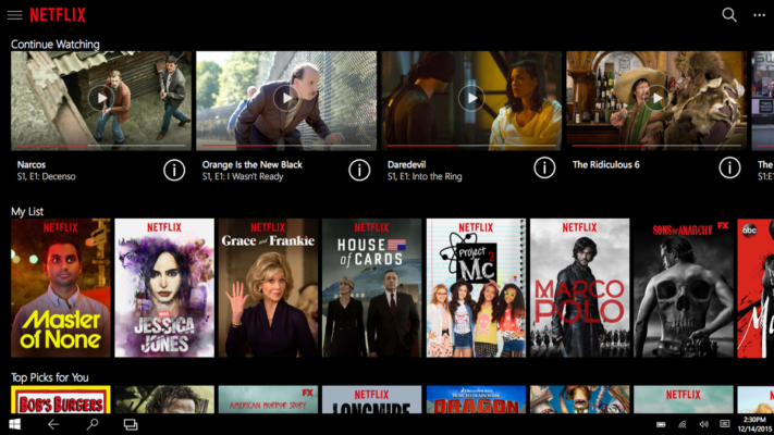
Context-based solutions are commonly used to present content pointedly. For example, Netflix’s recommendation algorithm carries out an invisible process of data collection, categorization, and resolution that requires no action from the user. Taking it a step further, content that is recently paused is presented in forefront and users are encouraged to “continue watching” unfinished material. Netflix is ensuring that its users will not have to search or click through any barriers to access the content they are most likely to want.
Following a similar content suggestion model, Spotify creates a custom weekly playlist for each user based on their listening habits. Spotify also suggests playlists based on the time, date and the user’s location. A user can tune in regularly for a unique experience, only having contributed by using the service. These solutions are using context-awareness to create a personalized experience, reward the user for being active, and encourage further participation.
Contextual Design is Functional
Context-sensitive designs can be used to solve a variety of product challenges:
- Need to guide a user through a process?
Create a status dashboard that presents a clear call-to-action, tracks their progress, keeps them updated, gets their attention when time has passed and rewards them when they have finished.
- Need to avoid drop-off on screens prone to user error?
Provide context-sensitive help. Tell them why they’ve encountered the error. Suggest solutions. Offer alternatives. Use the data you have to help them pass the barrier.
- Need to achieve a business goal the user wouldn’t seek out on their own?
Sneak in an extra step in their journey. Shift their focus with a context-relevant prompt that won’t be dismissed as generic. A good example of this is the iOS app shortcuts that appear when you pass a Starbucks or your bank.
Contextual Design Can Delight
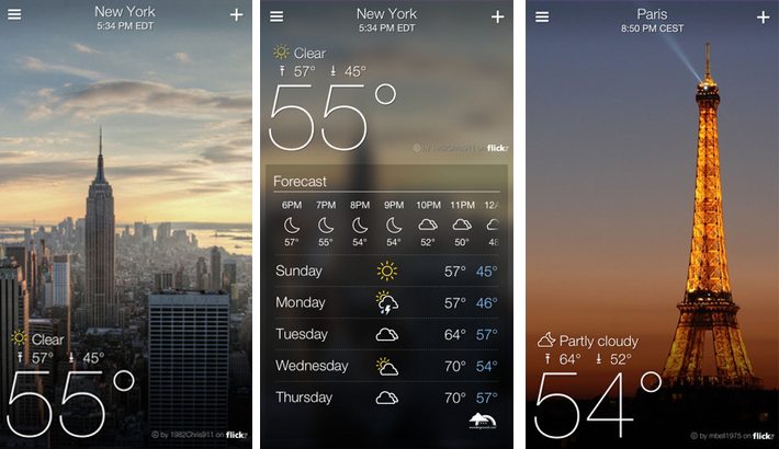
Users don’t always notice when you’re making their life easier, but if they are not thinking about the process then you’re probably doing a good job. In order to bring your product from good to great, you need a delight factor. It could be a cute illustration, a cool animation or a level of personalization they didn’t expect. I still remember opening the Yahoo Weather app for the first time and having an “Ooooo” moment at the photos of Toronto in the current weather condition. This was 3 years ago; that’s a lasting impression.
Contextual Design Challenges
Now that I’ve sold you on contextual design from a user’s perspective, I need to warn you that it’s not effortless to get it right. The result should appear straightforward but designing and implementing these solutions are not. One of the first challenges you may run into is collecting the data. Permissions can create barriers for gaining access to the necessary data. Designers need to plan for all scenarios, including if there is no data to work with. It is important that the users with strict preferences can still have a functional, positive experience with the app and do not feel punished. When the data is available, analyzing the information and using it appropriately might require a complicated technical solution.
“It is important that there is enough consistency within the UI that the user does not get lost and can maintain familiarity with the app”
Contextual designs will require more screen states than a static interface would and there will most likely not be one “happy path”. This means more edge cases and more testing. The changing nature of these solutions presents some extra user experience challenges as well. It is important that there is enough consistency within the UI that the user does not get lost and can maintain familiarity with the app. Here are some things to keep in mind when designing a contextual solution:
- Maintain consistent navigation structure. It may adapt or expand but make sure the user will always know how to get around.
- Make sure all content and functionality is accessible somewhere at all times. Hiding a piece of content from a dashboard to control the focus is okay if the user is able to find it elsewhere.
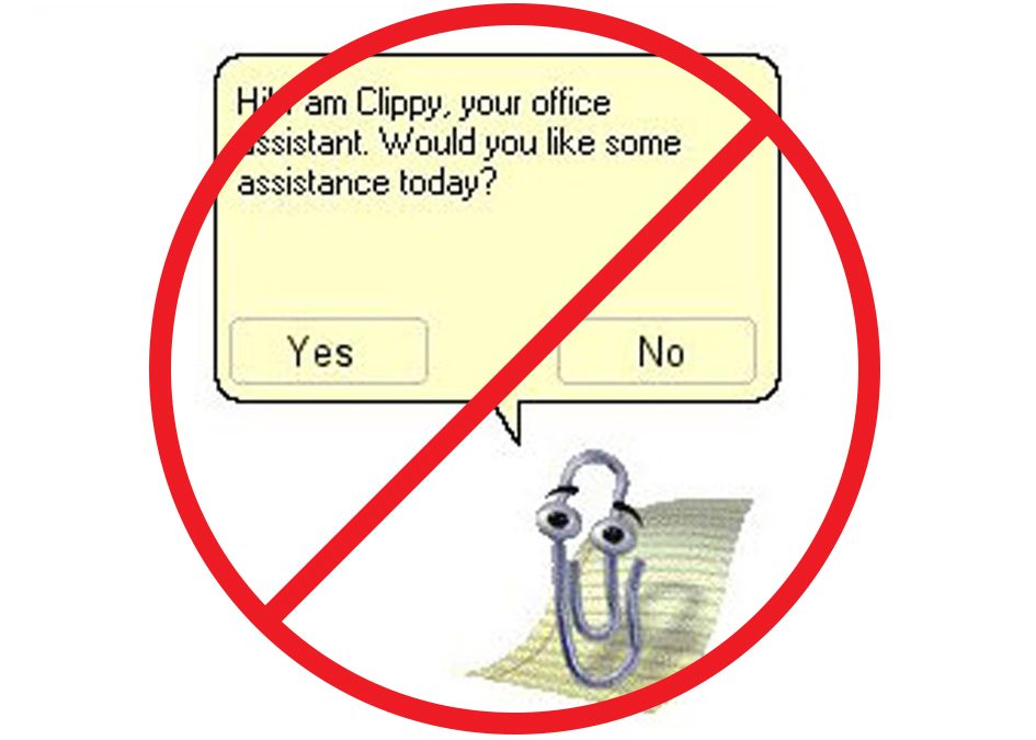
- Keep your super-users in mind and don’t insult their intelligence. Eventually, your users won’t need a guiding hand. Don’t be Clippy and berate users with unnecessary help. Instead, think about ways of rewarding active users like revealing more customization options.
Contextual design can be the foundation of your product or can just add a little something special. It can tell a story, personalize an experience, provide user support, or help your product meet a business objective. It may require some extra effort to design and develop but it will be worth it for every user to feel as if the app was designed for them.


