We’ve been flexing our tvOS development muscles on a number of projects over the past 2 months, and have identified a few common challenges that come with the territory. From our experience with tvOS, the aspects that presented the biggest obstacles were parallax animations, learning the focus engine, and implementing more accessible search functionality.
The following is a brief breakdown of these challenges, and how they can be overcome.
Parallax on Apple TV
The parallax animation in Apple TV apps will only work for images. If you wanted to do anything else – for example, display descriptions or text content – you will need to bake it into the image in order for it to be included in the animation. If you overlay additional elements, they will remain static unless they are part of the image.
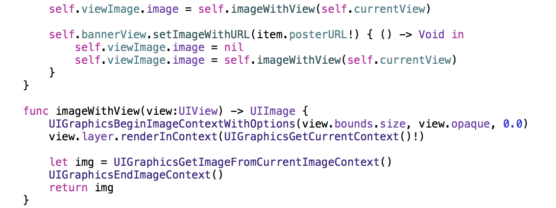
We recently ran into this challenge for one of our clients that required text descriptions alongside their movie/TV stills. This is how we resolved the issue so that the parallax animation functions correctly (steps and code).
- Get the data
- Create an empty view
- Add text labels and populate them with data
- Add placeholder images
- Request images from services
- Convert the view into an image
- Upon response from step # 5, repeat step #6
Learning How to Use the Focus Engine
tvOS relies on the Focus engine for determining the UI state. For users, the focus indicates where the users are within the app and helps them navigate between elements. In order to ease navigation and allow users to transition to other elements on the screen, you need to implement a focus guide. This can be difficult because this is a new concept and it’s not exactly intuitive.
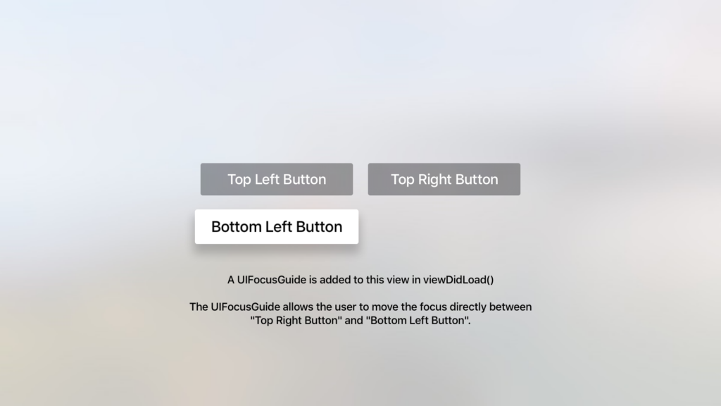
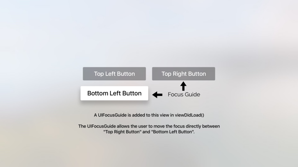
The focus guide is essentially an invisible area on the screen that responds to focus on events. In other words, the focus guide directs focus. Based on element positioning, the swipe gestures on the remote (up, down, right, left) aren’t always appropriate.
In the below image, for example, if a user were to swipe right, there is no element there.
In cases like these, you need to provide a focus guide that dictates where the focus will go using the preferredFocusedView function. For example, if the user were to move right in the below diagram, the preferred focus would be the top right button.
Focus Guide sample code can be accessed here.
Search Container
In tvOS, the search feature is modal. It’s always there, but you have to access it through a button. If that button isn’t on the page the user is on, then they can’t use the search function. Many developers will prefer to have the search function presented in a tab on the nav bar so that it is easily accessible to users, making navigation more intuitive.
In order for this to be accomplished, the search feature (UISearchController) needs to be part of a container (UISearchContainerViewController).
While tvOS employs many similar APIs and frameworks as iOS, there are some key differences that developers may find challenging. If you can overcome the initial difficulties with things like Focus Guides, animations, and search functionality, there are a lot of possibilities.


